via city gipsy blog
draped dining tables
Elle Decor
Skona Hem
Elle Decor
Domino
I didn't realize I had saved all these images of draped dining tables until they began to catch my eye. But I think I know the reason they jumped out at me today: I want to lighten up my dining table. It's a nice enough table: a double pedestal mahogany and yew. But my tastes have changed since I got it years ago. It's too dark and too traditional. I like this draped look, but I'm not too sure it's practical. Do I dare change out my table? Ouch! And will I regret it later?
And while we're at it - what about the mahogany bedroom furniture I just had to have a few years back? Now I yearn for a light-colored upholstered headboard and some kicky mis-matched bedside tables. But do I dare get rid of such an expensive investment?
What do you do when you realize your style has changed?
sometimes a girl can get lucky.....
my guest room with the new zebra rug
My guest room has a whole new look thanks to Lindsay at Everything LEB! I was the lucky winner of her zebra print rug giveaway from RugsUSA.com.
I'm so excited; it's just the thing I needed to layer on top of my seagrass rug.
I'm a regular visitor over at Lindsay's; check out her awesome style and great giveaways.
Thanks, Linds!
gray beauties...
these beauties are from The City Sage's review of French County Style at Home. I saw these images on No. 15 and could not resist them...
painting built-ins...
Elle Decor
Elle Decor
Atlanta Homes Magazine via Greige
I hope you all will indulge me in a post for a friend of mine. She asked me over the weekend about painting her built-in bookcases in her living area. Should she paint them the same color as the walls (SW Pearl Gray) or paint them white, as with the rest of the room's trim work/moulding?
My fellow decor and design addicts, what is your opinion? Have you had the same question? What did you/would you do...?
one woman - multiple personalities....
via Blog:Velvet
stylist: Lucyiana Moodie
.....or so it seems after yesterday's 'my style' piece. but I do love this dark, moody, and modern feel. the expanse of light does such wonderful things with the smoky grays and chartreuse colors. what about that coffee table and that glimpse of the shiny drum of a light fixture...?
what's your style - in one picture
Ally is totally rocking it out again with From the Right Bank's What's Your Style in One Picture Challenge III. I am so excited to be participating. But, babe. It Was Hard. And I tried to be really honest with myself for the challenge. Not my IDEA of my style, but my real style. What image reveals ME? In the end, I tossed Nate's living room for Katie Lee Joel that I always said was me in a room.
Here is the one I came up with and here's why:
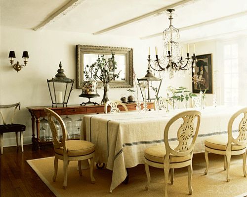
That Mirror! Makes me do a happy dance. I have one of a similar size and age in my dining room.
Chandelier. Don't have. Want. Badly want.
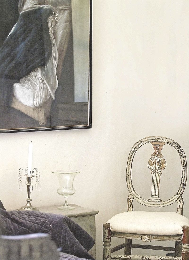
Collected art. Original drawings. Pieces loved. Pieces with a history.
Painted chairs - not all matching
The table's clean lines add a tad more modern feel.
Collection of candlesticks and magazines on the table = casualness
Almost a total absence of color in the room....
Ally, I can't thank you enough for this exercise. I learned so much about my REAL style.
Now it's your turn, babes. Please visit From the Right Bank and show us your style in one picture!
Image via Greige from Indenfor
o, this is just too good....
love all the different combinations here....
and the tangerine and gray...yum...
nate meets a perfect gray....
...well, not literally. but I have always said that this image is 'me' translated into a room. Nate, are you out there? What is that 'perfect' gray you use on your walls....? love you, man. mean it.
katie lee joel's living room by nate
Update! This gray is BM Pale Smoke (1584)
these moody rooms....
Love the dark and shadowy vibe in these two images from S. R. Gambrel. If I could just find a secret portal, I'd slip right in there. But, help me on this one. The mantle? It's always the hardest thing for me to get right. One larger art piece or several smaller ones? Which do you prefer in these images...?
weekend of wonderfulness...
via S. W. Design
A Perfect Gray received this weekend's reading recommendation from Desire to Inspire...
and Ally, From The Right Bank generously hosted A Perfect Gray on Friday...
a weekend of wonderfulness!
Thank you so much, my dear friends, for the love!
I'm over the moon about this.....
The lovely and talented Ally of From the Right Bank invited me for a guest post today! Please visit me there today as I reveal one of my favorite design trends at one of my favorite blogs.
Happy weekend to you all and my heartfelt thank you to all my readers and followers for hanging out with me....
'dior gray'
Can you detect the Nate Berkus influence here? This is the apartment of Lauren Buxbaum, one of Nate's design assistants. The walls are no doubt painted the 'dior gray' that Nate is so fond of. It's inspiration originated from the light gray color Christian Dior used in his dressing rooms.
I love this light and water-like color. It's beautiful with that pumpkin pie color that I like (on the sofa in the living room and chair in the bedroom).
Now, babies, all we gotta do is get this color! Benjamin Moore has a Dior Gray -2133-40 but it seems to be much darker. Does anyone have Nate's secret gray? Maybe he'll spill the beans on The Nate Berkus Show coming this fall.....
Information and images from an older issue of Chicago Home Magazine.
exotic beauty...
gray living spaces
Elizabeth Martin Design in Elle Decor
Elle Decor
via Cote de Texas
House Beautiful
via No. 21
via Slumber Designs
Andre Schievink's Stockholm apartment in
Skona Hem
Subscribe to:
Posts (Atom)